Designing a price alert system for professional energy traders — UX Case Study
How I designed a configurable price alert system for Tallarium, a fintech-adjacent OTC energy trading platform — balancing notification precision with cognitive load for professional traders.
Client
Sector
Fintech-adjacent
Energy Trading
B2B SaaS
Discipline
UX Design
Interaction Design
Notification Systems
User Research
Designing a price alert system that traders actually use
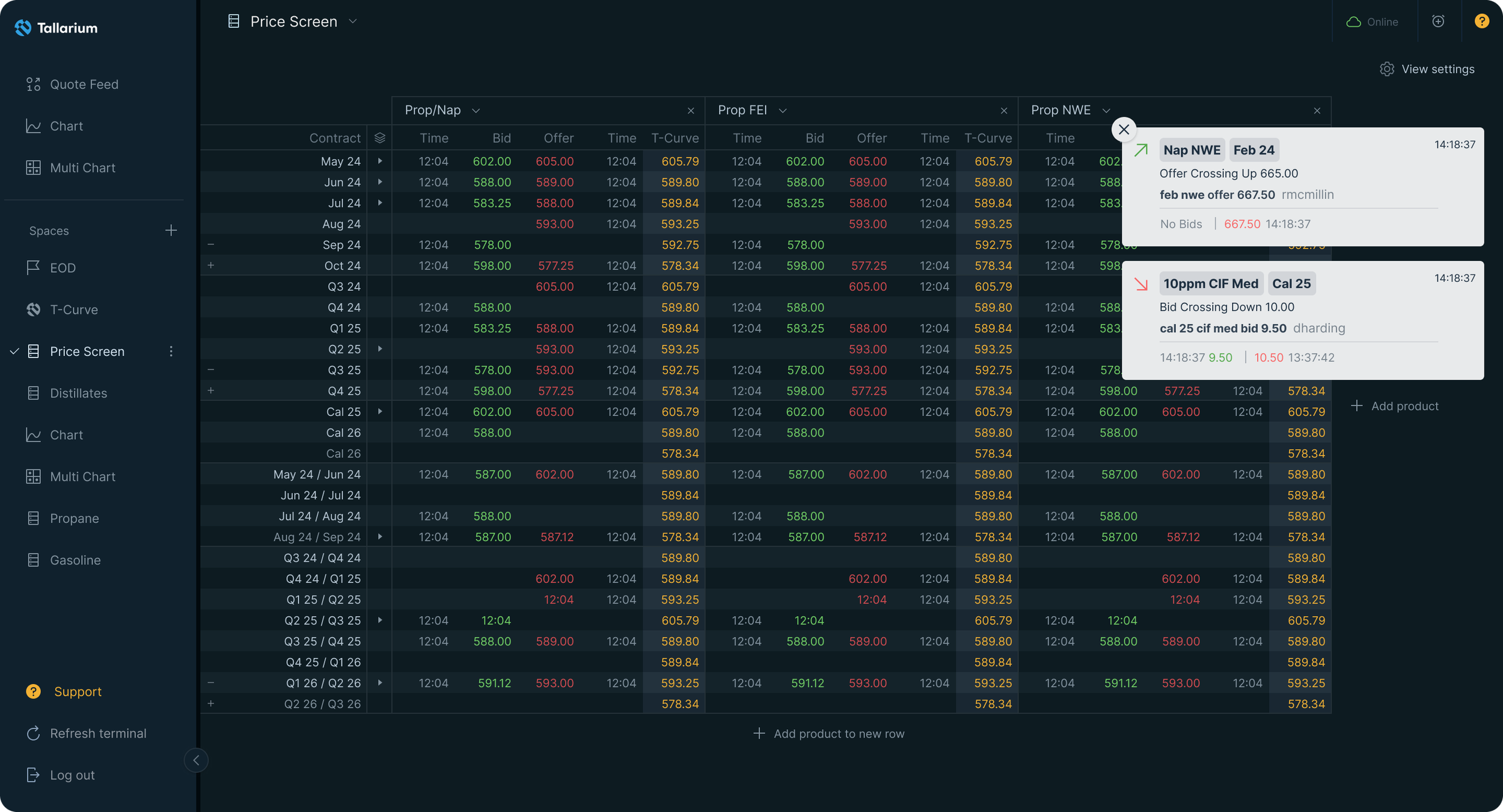
Tallarium is a pre-trade data and analytics platform for OTC energy markets. It aggregates fragmented pricing data — bids, offers, and trades across global benchmarks — into a single terminal used by professional energy traders. Missing a price movement on this platform isn't an inconvenience. It's a financial consequence.
When I joined the engagement, alerts didn't exist. There were system error notifications and action toasts I'd previously designed — but no way for traders to monitor specific price conditions across specific products and periods. That gap was costing them.
The problem wasn't just missing alerts. It was the risk of too many.
Professional traders work across multiple screens simultaneously. They're expert, time-pressured, and operating in high-stakes environments where signal quality matters as much as signal quantity. The challenge wasn't simply to add notifications — it was to design a system that traders would actually trust and rely on.
Two failure modes shaped the brief from the start.
Under-notification: a trader misses a price crossing a threshold. That's a missed opportunity or an unmanaged risk. Direct financial consequence.
Over-notification: a trader receives too many alerts, starts dismissing them automatically, and the platform loses its edge. This failure mode is slower and more insidious — engagement erodes quietly.
Both failures damage trust in the platform. A trader who tunes out notifications has effectively stopped using the product, even if they're still logged in. FullStory data confirmed this behaviourally — we could see alert dismissal patterns, inaction after triggers, and drop-off in engagement from users who'd set broad alerts and been flooded.
Research: what traders actually needed
Three inputs shaped the design direction.
User interviews with traders. I ran structured sessions with friendly traders, deliberately framed around their workflow rather than the product. The goal was to understand how they monitored markets — not how they used Tallarium. What came back was precise: "Don't tell me the market moved. Tell me that this specific product, in this specific period, crossed this specific number — and only tell me once unless I tell you otherwise." That sentence became the design brief.
FullStory behavioural analysis. Observational evidence of where existing notification patterns were breaking down. Alert dismissal rates, inaction after triggers, stale alert accumulation — all visible in session recordings. The data confirmed what the interviews suggested: traders needed specificity, not volume.
Collaboration with the CEO and VP of Product. Both had deep domain expertise in how energy traders think about price conditions. This wasn't a handoff relationship — it was a working partnership where domain knowledge and design thinking moved together.
One significant moment in this process: there was internal debate about whether traders would engage with a highly configurable alert system at all. The assumption was that traders would find it too complex and want something simpler. Our read from the interviews was the opposite — traders already think in exactly these terms. Product, period, direction, threshold. We weren't building a new mental model. We were building their mental model. We made the case. The feature went through.
Design decisions: precision over volume
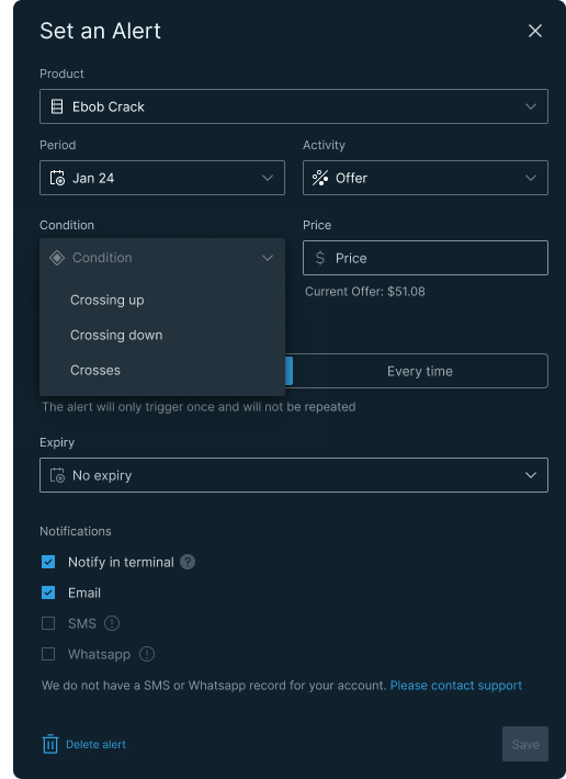
The Set an Alert modal is built around a logic that mirrors how professional traders actually think about price positions.
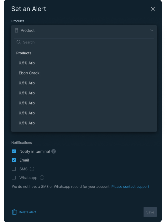
Three-axis specificity. Every alert is defined by product, period, and activity side. Not just "Ebob Crack" — but "Ebob Crack, January 24, Offer side." This granularity isn't complexity for its own sake. It's the minimum required to be useful to a professional user.
Live price context at the moment of setting. When a trader selects a condition and enters a target price, the current market price is shown inline — "Current Offer: $51.08." This means they're calibrating against reality, not guessing. A small detail with significant consequences: it directly prevents miscalibrated alerts that generate noise rather than signal.
Directional conditions. Crossing up, crossing down, crosses. Each represents a fundamentally different trading position and intent. A trader watching for a price floor is doing something different from one watching a ceiling. The design reflects that.
Trigger control: once or every time. This is the primary mechanism for preventing notification overload. A one-time alert self-expires after firing — it's for a specific moment. "Every time" is for ongoing surveillance. The copy beneath the toggle adapts to reflect exactly what will happen, removing any ambiguity about behaviour.
Expiry with calendar picker. Alerts can be set to expire automatically on a specific date. This prevents the accumulation of stale alerts — conditions that no longer apply but continue to trigger. A trader who set an alert for a January contract in February is generating noise, not signal.
Notification channels. Terminal, email, SMS, WhatsApp. Traders aren't always at their desk. The UX handles missing contact data honestly — "We do not have an SMS or WhatsApp record for your account" with a link to contact support — rather than silently disabling options or showing them greyed out without explanation.
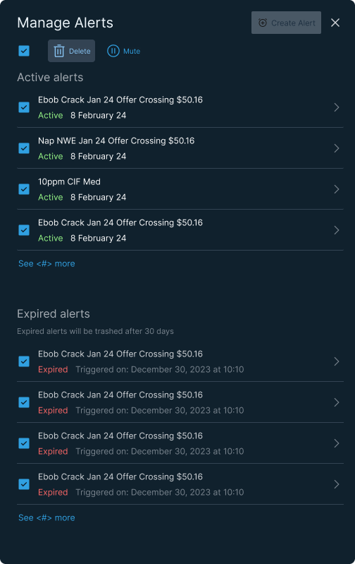
Manage Alerts list. Active and expired sections, status and date visible at list level, bulk select via checkboxes. The expired section shows trigger timestamps and auto-trashes after 30 days — a system-level solution to alert list hygiene that requires nothing from the user.
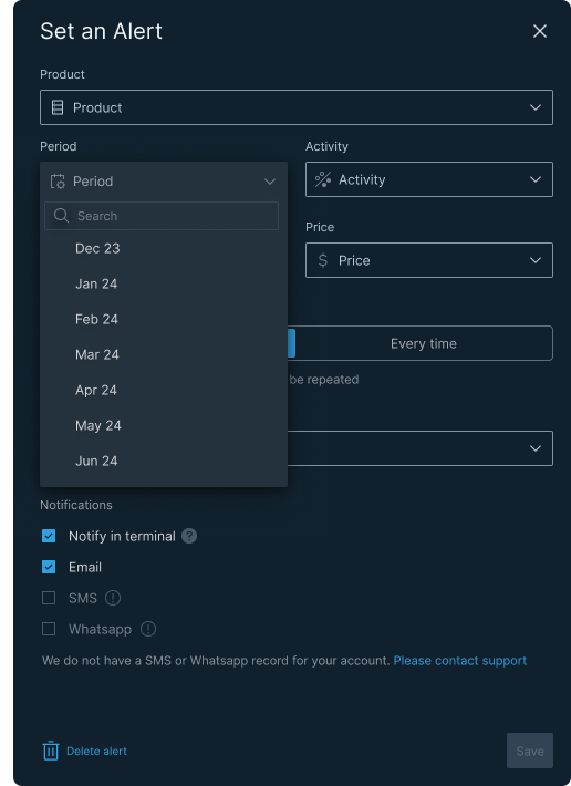
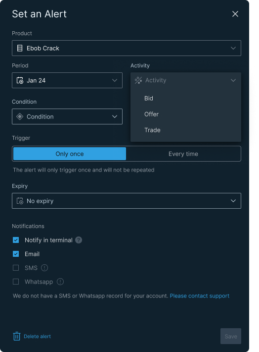
From left: Product search open Every alert starts with a product. The searchable dropdown handles a large and complex product list without overwhelming the form; Activity selection (Bid / Offer / Trade) Bid, Offer, or Trade — three fundamentally different market positions. The alert is only meaningful if it knows which side of the market to watch; Condition open with live price visible Before the trader sets a threshold, the current market price is already visible. They're calibrating against reality, not guessing.
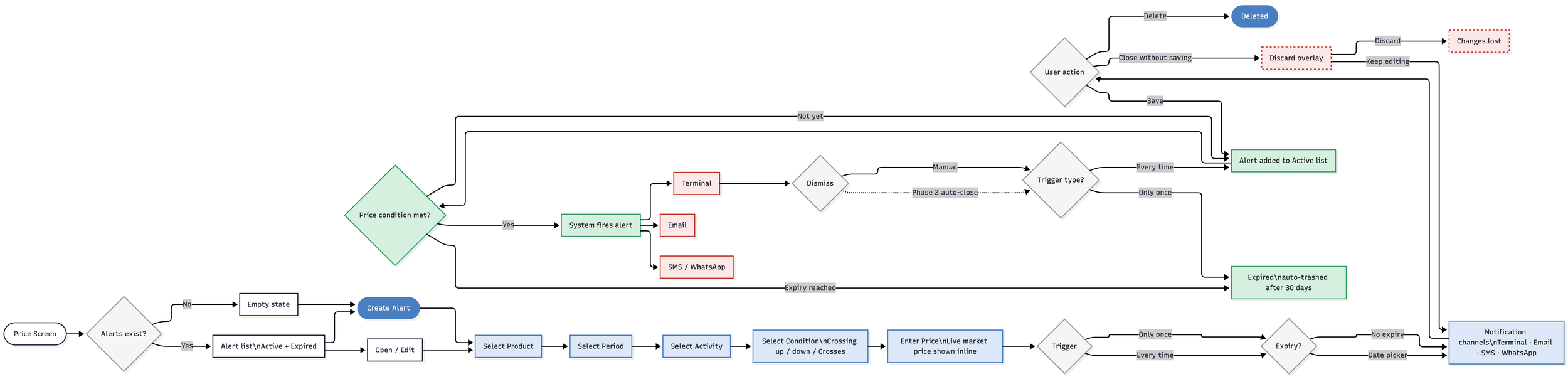
Flow
The alert system covers six stages: entry from the price screen, alert state management, user configuration, save/discard logic, alert delivery across channels, and lifecycle management from active through to expired. The discard overlay — triggered when a user tries to close the modal with unsaved changes — prevents accidental data loss in a context where every configuration decision is deliberate.
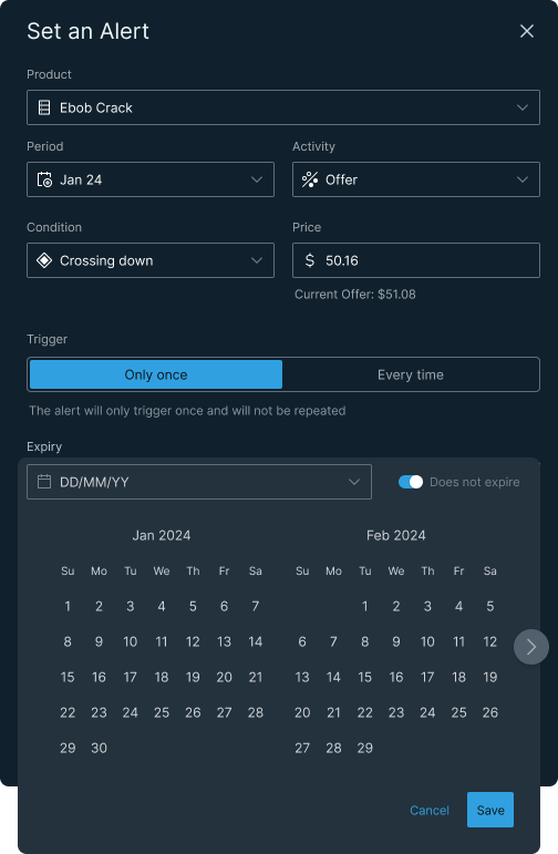
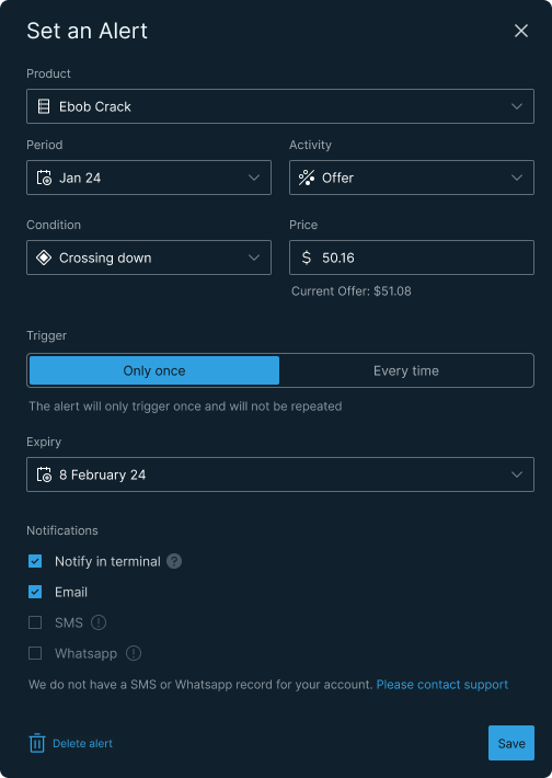
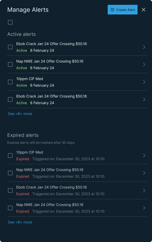
From left: expiry calendar open — date not yet selected, Does not expire toggled on; expiry set to 8 February 24, all fields confirmed, Save active; Manage Alerts default view — active and expired sections, trigger timestamps visible; Manage Alerts with all items selected — Delete and Mute actions available.
Outcome
The alert system shipped. Traders used it. The feature came directly from trader requests — confirmed in the user interviews — which meant adoption was built in before the first line of code was written.
The customer base is early-stage and small, so headline volume metrics aren't the story here. The more meaningful signal is qualitative: the feature addressed something traders were asking for, built in the mental model they were already using, and removed the two failure modes — under and over notification — that would have undermined trust in the platform.
Why this matters beyond trading platforms
The underlying design problem — when to notify, how to give users precision control, how to prevent cognitive overload in a high-stakes context — is not specific to energy trading. It applies anywhere real-time financial data meets user attention: digital wallets, payment apps, currency transfer platforms, investment tools.
The principles are transferable. Precision over volume. Calibration against live data. System-level expiry to prevent noise accumulation. User control without user burden.